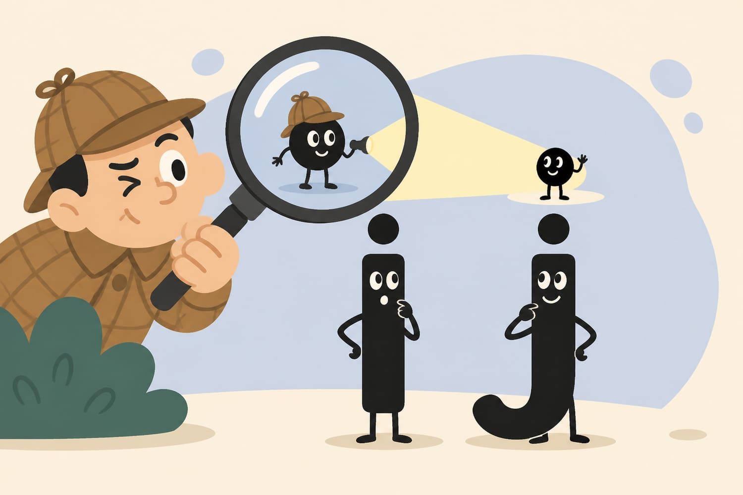
The Short Answer: A Tittle Is That Tiny Dot
A tittle is the small dot above a lowercase i or j. Pronounced TIT-ul, it helps distinguish those letters from nearby strokes. The word can also refer more broadly to a tiny written mark—or even a very small amount of something. Small name, small object, surprisingly large history.
Meet the Hardest-Working Dot in the Alphabet
Look at the words interesting, jelly, or miniature. Every lowercase i and j carries a tiny dot above it. Most of us learn to add those dots as children, yet few of us are told that they have a proper name.
That name is tittle.
According to Merriam-Webster’s definition of “tittle,” the word means a point or small sign used in writing or printing, especially as a diacritical mark. It can also mean a very small part or quantity—as in “not one tittle of evidence.”
The plural is tittles, which gives us the delightful possibility of discussing “the tittles in this sentence” while sounding as if we are speaking complete nonsense.
Tittle belongs to a satisfying family of words that name familiar but overlooked things. The groove between your nose and upper lip, for example, is called a philtrum. Once you learn these words, ordinary objects suddenly appear to have been wearing secret name tags all along.
Why Do the Letters i and j Need Dots?
The tittle is not merely decorative. It developed as a practical aid to reading.
In medieval handwriting, many lowercase letters were constructed from short vertical strokes known as minims. The letters i, m, n, and u could therefore become difficult to separate, especially when packed closely together in dense handwritten text. Harvard’s guide to reading medieval handwriting demonstrates how scribes used these repeated strokes to form different letters.
Imagine trying to read the word minimum if every letter looked like a row of nearly identical fence posts:
ıııııııı
A small mark above an i made the letter much easier to spot. The tittle effectively said, “This particular stroke is an i, thank you very much.”
The mark did not appear everywhere at once or in one perfectly planned moment. Writing conventions tend to evolve gradually as scribes, printers, and readers adopt practices that make text clearer. Over time, the mark above the i became a dot and settled into the standard letterform we recognize today.
In other words, the tittle is an early readability feature. Medieval writers did not have zoom controls, adjustable fonts, or backlit screens. They had ink, writing surfaces, and a genuine need to prevent their words from turning into picket fences.
Why Does the j Have a Tittle Too?
The answer lies in the close relationship between i and j.
For much of their history, the two were not treated as fully separate letters. The shape that became j began as a lengthened or embellished form of i, often used in particular positions. Only gradually did j develop its own identity, uses, and sounds.
Because j grew out of i, it inherited the dot. Think of the tittle as a tiny family heirloom.
This relationship also explains why i and j sit beside each other in the alphabet. The letter j was a late arrival as an independent member of the Latin alphabet, even though its shape had been used earlier as a variation of i.
Today, lowercase i and j normally have tittles in English, while their uppercase forms—I and J—do not. As we will see, however, other languages have their own rules.
Where Did the Word “Tittle” Come From?
Despite sounding like a playful combination of tiny and little, tittle was not created by blending those two words. That resemblance is simply a happy coincidence.
The word came into English through forms such as Middle English titel and Medieval Latin titulus. Its deeper history connects it with the word title, which once carried senses involving inscriptions, labels, and marks. Merriam-Webster dates the word’s known English use to the Middle Ages.
That makes tittle and title linguistic relatives. One refers to a very small mark; the other usually refers to the name of a book, article, film, office, or work. English has essentially taken related historical material and used it for jobs at opposite ends of the visual hierarchy: the big heading and the tiny dot.
The word tilde, the name of the wavy mark in letters such as ñ, also has a related linguistic history. Language loves recycling old roots almost as much as it loves hiding names in plain sight.
Is Every Dot Above a Letter a Tittle?
Not necessarily.
In its broadest sense, tittle can mean a small mark associated with a letter. In everyday typography, however, it most commonly refers to the built-in dot above lowercase i and j.
Other dots and marks may have different names and functions:
- The two dots in ä may be called a diaeresis or an umlaut, depending on the language and their role.
- The dot above Polish ż is a diacritical mark that helps identify a distinct letter.
- The mark in é is an acute accent, not a stretched or stylish tittle.
- A period is punctuation, not the tittle of the sentence.
- A bullet point is also not a tittle, no matter how much it wants to join the club.
The difference is partly about function. In English, the tittle is normally considered part of the standard lowercase i or j. It does not tell you to pronounce the letter differently. Many other diacritics provide information about pronunciation, stress, tone, or letter identity.
If oddly named symbols are your kind of thing, the tittle has a much louder typographical cousin: the grawlix, the name for combinations such as @#$%.
What Happens When an i Gets an Accent?
In many writing systems, a mark placed above an i or j replaces the ordinary tittle rather than balancing on top of it.
Consider these letters:
- í — i with an acute accent
- î — i with a circumflex
- ï — i with a diaeresis
- ĵ — j with a circumflex
You usually do not see a separate dot squeezed beneath the added mark. In digital typography, Unicode describes i and j as “soft-dotted” characters because their dots may disappear when certain marks are placed above them.
That rule is not universal. Lithuanian, for example, may retain the dot in certain accented forms, particularly where preserving it helps maintain the letter’s identity. Typography must follow the needs of each language rather than imposing one rule on everybody.
This is why designing a good font involves much more than drawing 26 English letters. A typeface intended for international use must account for hundreds of characters, accents, combinations, and language-specific conventions.
In Turkish, the Dot Changes the Letter
English speakers can treat the tittle as a helpful visual feature. In Turkish and Azerbaijani, the distinction between dotted and dotless i is much more important because the forms represent separate letters.
Turkish uses two pairs:
- i becomes uppercase İ
- ı becomes uppercase I
Notice that the uppercase form of dotted i keeps its dot: İ. Meanwhile, lowercase dotless ı looks like an English i whose tittle has gone missing.
These are not decorative alternatives. They are different letters with different pronunciations, and substituting one for the other can change a word. The Unicode Consortium’s explanation of dotted and dotless i notes that software must use language-sensitive rules when changing Turkish text between uppercase and lowercase.
So yes, a tiny dot can matter to spelling, pronunciation, searching, sorting, and computer programming. Never underestimate punctuation-sized objects.
What Does “Every Jot and Tittle” Mean?
You may have encountered the expression “every jot and tittle.” It means every tiny detail, with nothing overlooked.
The phrase is famously associated with Matthew 5:18 in the King James Bible, where “jot” and “tittle” refer to extremely small elements of writing. In that context, tittle does not specifically mean the dot above an English i or j. It carries the broader sense of a minute stroke or mark.
This figurative meaning survives whenever someone examines every tittle of a contract, argument, or plan. It is closely related in spirit to the familiar instruction to dot your i’s and cross your t’s—finish the details and make sure nothing has been forgotten.
A missing tittle might seem trivial, but in handwriting it can make an i harder to recognize. The phrase therefore works both literally and metaphorically: tiny finishing touches can make a major difference.
Five Tiny Tittle Facts Worth Remembering
- Tittle is pronounced “TIT-ul.”
- The plural is “tittles.”
- It most commonly names the dot above lowercase i and j.
- It can also mean a tiny mark, part, or quantity.
- In some languages, the presence or absence of the dot distinguishes separate letters.
That is an impressive résumé for something smaller than a crumb.
A Tiny Mark With a Big Job
The tittle is easy to ignore because it does its work so quietly. It separates letters, improves readability, carries centuries of writing history, and occasionally causes headaches for font designers and software developers.
It is also a perfect example of why words that look fake can be completely legitimate. Tittle sounds invented, yet it names something you have written thousands of times.
The next time you dot an i or j, take a moment to appreciate that tiny speck. It may be small, but without it, the alphabet would be just a tittle more confusing.